Aug 11, 2025
Data alone doesn’t inspire—it’s the story behind it that creates impact. In presentations, your job is to make numbers meaningful and memorable.
Detailed Process:
Start with a Narrative
Instead of showing a raw table of sales figures, frame it as a journey: “Our sales have doubled in 18 months, and here’s how we did it.”Choose the Right Visualization
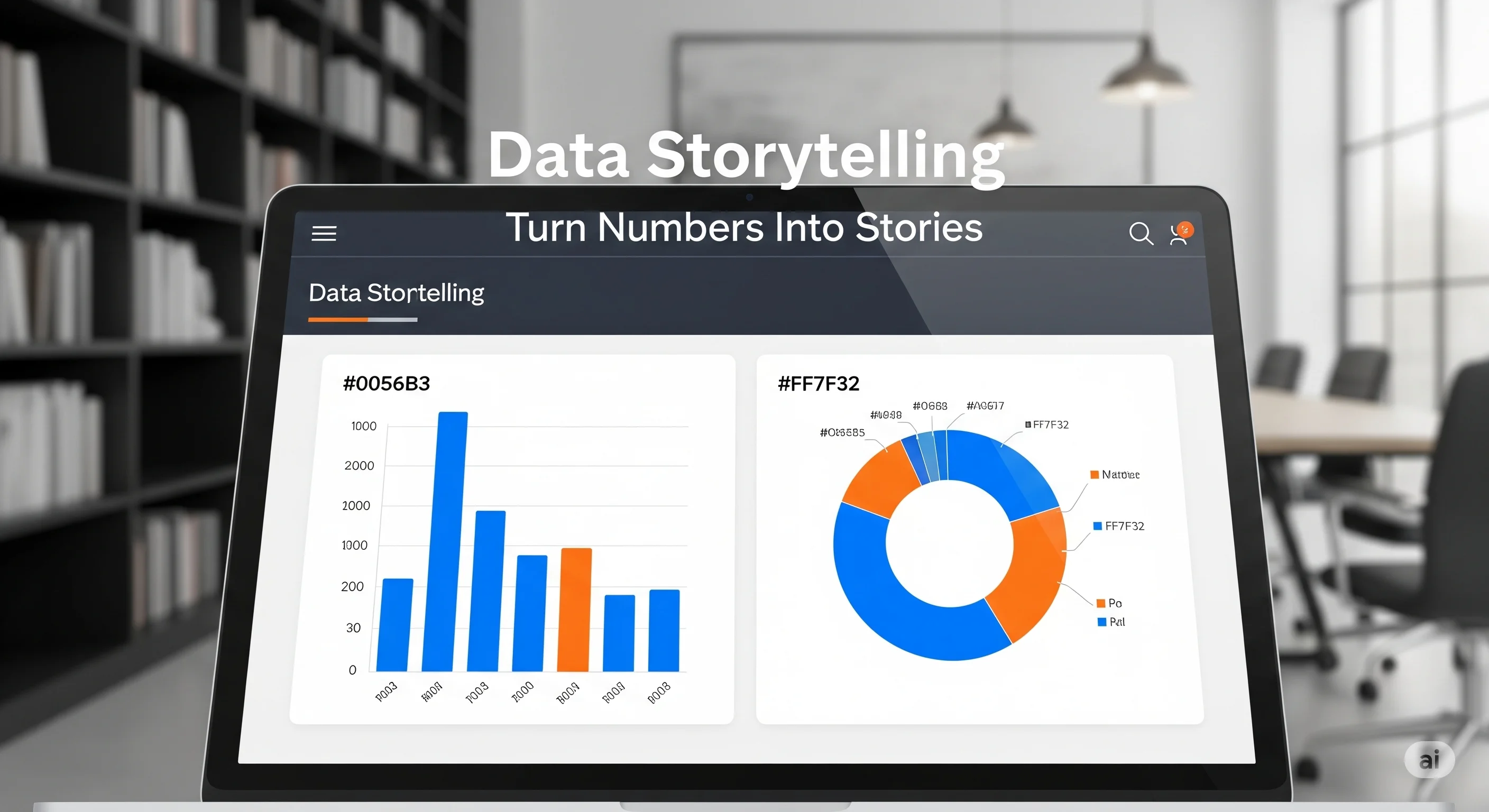
Bar charts: Great for comparisons.
Line charts: Show trends over time.
Pie charts: Display proportions.
Highlight Key Data Points
Use bold colors, callout shapes, or animations to draw attention to critical numbers.Relate to Your Audience’s Goals
If you’re presenting to stakeholders, focus on revenue, ROI, and cost savings. For a training seminar, emphasize learning outcomes or efficiency improvements.Simplify Complex Data
Break down large datasets into digestible chunks. Use one chart per slide, and avoid overcrowding with too many numbers.